Hello!
It took me a while but I finally moved my blog over to my personal domain. If you currently subscribe to my blog:
1. You Rock!
2. Please go to the blog’s new location and resubscribe.
If you don’t subscribe, it would be completely awesome if you did! 🙂
I will be posting regular design posts as well as posts regarding social media and other Internet marketing information.
And finally I just want to give a huge thanks to all my readers!
You Are Awesome!
Leave a comment | posted in Uncategorized
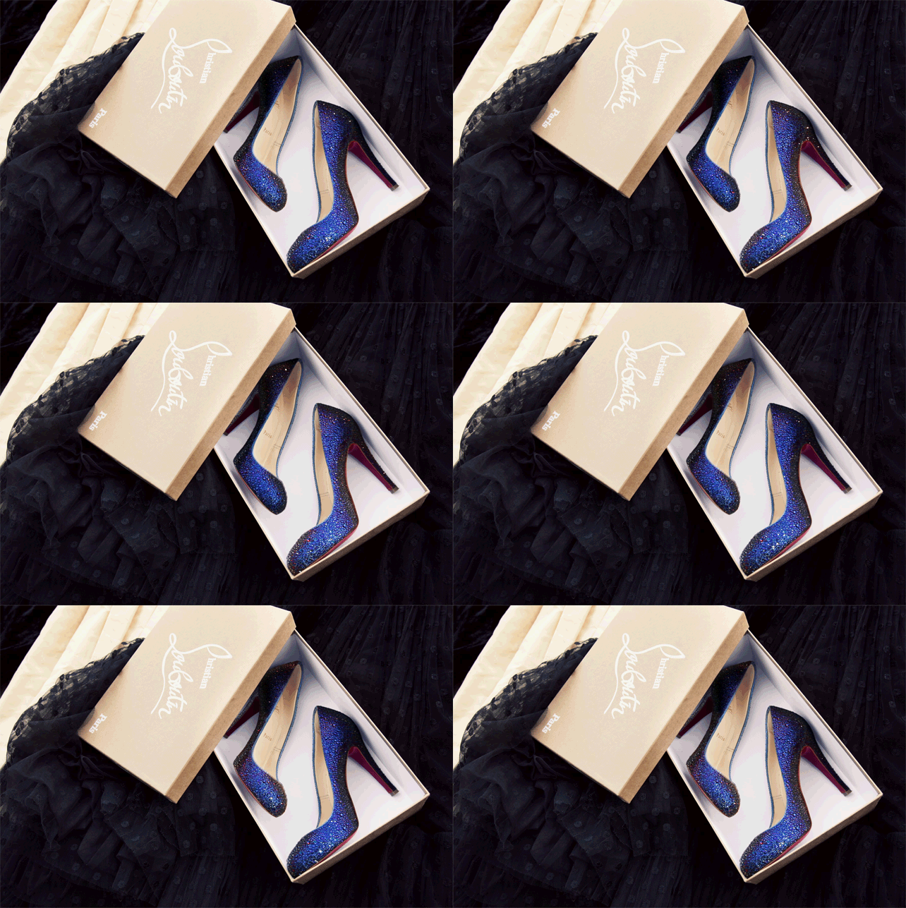
First of all, what the heck is a GIF? In a nutshell, a GIF (or Graphics Interchange Format) is a file format that allows for a series of photos or images to be strung together and cycled through on a set time frame (not unlike a slide show). Generally, they are found running in an endless-loop. They used to be seen most commonly as those horrid smiley faces and words and angels and signs that jumped and waved and tried to get your attention on early websites. Or they were used to bling-up pre-teen MySpace pages. (not that I would know anything about that…)
I am extremely impressed by those who now make gorgeous, artistic GIFS out of a series of photos. They are simply stunning. And the main names associated with creating wonderfully artistic and beautiful gifs? That would undoubtedly be:
Jamie Beck and Kevin Burg
They coined the term “cinemagraph” to describe these types of photo GIFs. Take a look and be amazed. Then, go check out Jamie’s tumblr (From Me To You) and their cinemagraph site for more!


Have you ever made a GIF? I did for a class but I’m to embarrassed to put it up with these outstanding ones. But if you have any of your own, or want to share any others not done by Jame and Kevin please leave a comment!
Plus tell me which is your favorite! Either on from here or from their site or Jamie’s tumblr.
Leave a comment | tags: artist, creative work, GIFs, people, photos | posted in Creativity
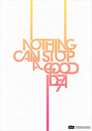
Sometimes posters – for movies, events, or anything really – are just too cluttered. And I often feel like there is some abuse of photography. Too many poster designs hanging up just throw up a picture and call it good. Movie posters in particular do this. It obviously works considering the amount of posters that are bought, but I wouldn’t call it great design. Great design should capture the essence of its subject by using only what is necessary. Great design, is simple. I’m happy to see a recent trend among designers leaning toward simplicity in design, particularly movie posters. (Apparently I’m not the only one who doesn’t like the current movie poster designs). I’ve collected a few simple poster designs below, movies are the prevailing genre that use posters, but I’ve included a other examples as well.

I love that all the words are connected and that the lines don't "stop" but appear to keep going beyond the paper. Found originally here.

There are a lot of simple Inception posters out there, which is interesting as the idea is considered complex, but this is by far my favorite. The simple showing of three levels with the last falling apart. Simplicity at it's finest. Designed by Christopher Conner

Each designer was asked to represent a musical genre using one element and one typeface, this is my favorite of the bunch. From edits by edits, found here.

A great minimalist depiction of Scott Pilgrim vs the world by Blake Jones.
1 Comment | tags: creative work, fabulous prints, posters, Prints, simple design, simple posters | posted in Creativity, Graphic Design
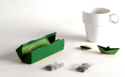
About a year ago I did a post about creatively designed tea infusers. People do a lot of awesome design work with tea pots, infusers, coffee mugs, coffee pots, and a whole mess of over beverage related items. Most recently on my radar are wonderfully and uniquely designed tea bags. If you haven’t seen any, be prepared to be blown away. I think anyone would drink more tea if they had these, sadly I believe all of these are only design concepts and not available for purchase.

Soothing origami with soothing tea. A perfect combination from Russian designer Natalia Ponomareva.

A tea bag that folds out to an origami boat and floats on top of your tea. Adorable. (Found on Swiss Miss)

The Tbag uses the pronunciation of tea quite literally.

This is one of my all time favorites. I found it a long time ago and find it incredibly clever. Designed by Soon Mo Kang
2 Comments | tags: artist, creative work, creativity, Products, tea, tea bags | posted in Creativity, Product Design
I think making your workspace inspiring is important, and your computer is often a big part of that. Having a bland and basic desktop background does not equal inspiring space in the least. And if you are me, you no longer have time to make your own desktops like I used to (that was actually how I first started learning to use Photoshop, hurray for being self-taught!) Fortunately there are a great many fantastic and free downloadable desktop wallpapers around the webisphere. I have collected some here. Hopefully they can contribute to your inspirational work spaces:

Fossil often comes out with fantastic wallpapers and this one of their best

Lucian Marin is gracious enough to offer up fantastic wallpapers on his website. This one is superb for designers.

Smashing Magazine always collects fantastic wallpapers every month from various artists. This one is nice and simple and lovely.

This was originally from 55 Hi's but appears the original file is gone. I found it on Chic-Type.
Leave a comment | tags: creative work, creativity, desktop, inspiration, wallpapers | posted in Creativity
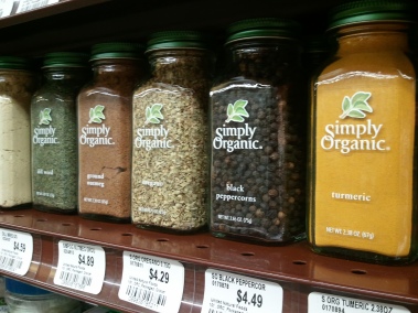
 I recently took a trip to the Weatsfield store in Ames, Iowa. As I walked around the new store, I found myself coming across inspiring product designs. I won’t lie, I often buy things based on their packaging and weather I like the design. (Coffee is one particular example) It would seem, after walking through Wheatsfield, that health food and local companies certainly seem to know how to design a product.


Well I hope you were inspired by my findings as well. If you come across any outstanding product designs make sure to share them with me!
4 Comments | tags: creative work, inspiration, labels, Products | posted in Graphic Design, Product Design
I still spend a lot of time searching for really great prints about being creative, and often specifically about design. For Christmas I received this wonderful print from etsy about creativity:
Wonderful, yes? But I keep looking for the inspiring poster that are everywhere on the web. I may be looking for creative inspiration, design inspiration, or something that will make me work as hard as I can on my project. Here are a couple of other ones I’ve come across on Etsy:
Good for those long nights when you wonder why you started designing in the first place.
Scribbles!
In addition I had to share this great print from
The Heads of State. How wonderful is this:
This last is my favorite for now. Hopefully I will have more to share sooner rather than later!
6 Comments | tags: creativity, fabulous prints, graphic design prints, Prints | posted in Graphic Design
I’ve been busy lately, hence the lack of posts. I was finishing designing and building my very own portfolio website. This was a mammoth project for me simply because I was so obsessive-compulsive about it being just right. Understandable since this site sort or represents me. And by sort of, I mean does. It’s still not exactly where I would like it to be, but it’s definitely presentable.
I am hosting through Web Hosting Hub and am pretty happy with their service so far. There have been a few bumps along the way but all and all it’s worked like it is suppose to. They also give you $75 of adwords credit, but I’m not sure what exactly I want to do with that just yet.The rest of my work has been done in Photoshop and Dreamweaver. And I feel a little like a pro when it comes to CSS now as that was the main code used in the website. In reality I’m probably still only in the intermediate stage of knowledge rather than advanced, but that’s still something.
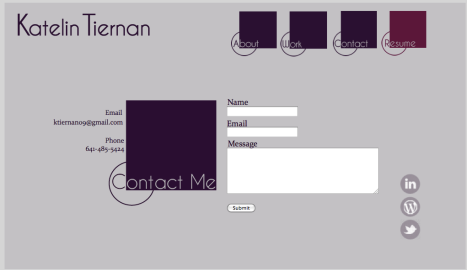
Without further ado, I present www.katelintiernan.com


Leave a comment | tags: creative work, portfolios, web hosting, webfolio, websites | posted in Professional Development, Web Design
A while back I did a post about graphically designed resumes. The fact is, a resume may be the first impression a potential employer gets of you. If you are applying for a design position, or if that is just one of your skills, having a resume that can show a hint of your design abilities is important. It’s doubly so if you don’t have a web portfolio they can just link to and see your work. However, your resume needs to be easy to print as well as visually appealing. Take a look at some examples:

This uses a unique logo and white space effectively for a visually appealing resume
(akashrine on deviantart)

The vertical design here is superb. And this looks great and is a good example of good document design (littlearashi on deviantart)
This one really pushes printability, but it is very unique and visually stimulating.

The orange probably wouldn’t print the best, but otherwise it looks great!
(Roland Martial on Behance)
I will keep an eye out for the other ones and I will share if I find anything great! Please share if you find anything amazing.
Leave a comment | tags: creativity, resumes, visual resumes | posted in Professional Development
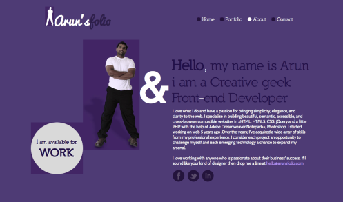
I’ve been looking at portfolios a lot now as I’m starting to design my own. There are so many options out there, and fantastic sites it’s hard to decide what to do for a design. One thing I do know it that I want to include purple as a main color. I am pretty in love with the color purple; it’s the color of my birth gemstone (February:Amethyst), the color of my University (UNI Panthers, purple and gold), and it is considered the color of creativity. What’s not to love? Arun’s folio is a purple and white based portfolio for that manages to use a bright purple and not make it seem obnoxious.

great use of doodles

I'm not sure how I feel about the white on the dark purple. It's a bit hard on the eyes

great use of the idea of contact (snail mail goes digital)
Leave a comment | tags: inspiration, portfolios, webfolio, websites | posted in Web Design

