Author Archives: ktiernan

Yoga and Pilates Business Cards

There are some fantastic and extremely unique business cards out there. Recently I have come across quite a few fantastic ones in regards to Yoga and Pilates. It’s easy to see why these exercises lend themselves to such unique designs if you’ve ever practiced either. I’m inclined to think the designers of many of these cards had done so.

And my personal favorite (by far):

I had trouble finding sources for these cards, if you have any of the sources/designers please let me know.


Inspired By Prints

I am constantly finding new and fabulous prints that I want to hang everywhere, especially around my computer where I tend to do most of my creative work. Since I find them so inspiring I thought I’d share a few and perhaps inspire some of you (did you catch the rhyme?)

Don't Forget To Be Awesome Inspirational 11x14 Print
If someone insists I must, I must.

Etty Hillesum Quote - Digital Color Print
Perfect for the days when you are so frustrated you might cry. (we’ve all been there)

This one doesn’t require any additional comment.
Acidfruit | Mohammad Awwad
Just for fun. I have yet to find this actual print, if anyone knows where I can get it or one like it PLEASE let me know. I would love to have it.

Flash Drive Makeover

I have three flash drives. One of which is a Quirky Split Stick so counts as two. Flash drives are so important though if you are like me and running around from place to place with various projects most of the time. Not only having them, but keeping them safe from the possibility of say a computer crashing.

Well the design of flash drives has really gotten impressive. People are stepping it up when it comes to both the look and the overall functionality of a flash drive. Take a look below to see what I mean.

Oooms Wooden USB

Logical Art Jewelry+Flash Drive Collection

Logical Art Jewelry+Flash Drive Collection


AromaUSB

Yanko Design Aroma USB (doubles as an air freshener)

unnamed l9s0stuy5m 4GB FlashHarp   Flash Drive + Harmonica

Flash Harp: A flash drive and a playable harmonica in one.

And those are just a few of many. I am torn between wanting the flash harp or the Logical Art jewelry ones…


Occupy the Internet

As many if not most throughout the nation are doing, I have been researching Occupy Wall Street. I wanted to get a better sense of who they are and what they want. I want to be informed, as should everyone, however that is another issue entirely.While going through this article and that website, I noticed that some of these site which have gone up quite quickly are pretty great the time crunch considered. Occupy Together, is one I particularly liked and it also gave me some information about how the web is being involved.

May First, a web hosting service is offering free web hosting to Occupy related websites. I find that absolutely terrific. The organization itself sounds terrific, stating on their about page that “MF/PL is an organization that redefines the concept of “Internet Hosting Service” in a collective, progressive and collaborative way.” It will take a little more time than a traditional server would to get the site up and running, but that’s because they are volunteers according to Occupy Together. Regardless of the time table, this is a fantastic resource. The internet should be a medium for expressing just this sort of discontent, and I’m glad to see that at least one web hosting service is on board with that idea.

Occupy Together Website:


Remembering Steve Jobs

I just want to do one quick post to mention and remember Steve Jobs, a true visionary and genius. I had always hoped to someday meet him, and I am truly saddened by this loss. The world has lost a great man. I think apple put it best:

Apple has lost a visionary and creative genius, and the world has lost an amazing human being. Those of us who have been fortunate enough to know and work with Steve have lost a dear friend and an inspiring mentor. Steve leaves behind a company that only he could have built, and his spirit will forever be the foundation of apple.”

photo via NYT


Looking for Inspiration

I have, for some time now, been throwing around the idea of developing a logo for myself to put on my not yet existent portfolio site as well as my resume and such. Partly, I just like logos and sort of want one for myself. But there is also a precedent for basically “branding” yourself when going out into the world to find work. So I’ve been looking for some inspiration. Here are a few that I found:

Oskar Kullander branding, found on Behance:

I’m a little sad I didn’t come up with this logo myself. I love the circle and including a ‘K’ is definitely and option for me

Design Mark found on Logo Pond:


I really like the idea of creating a logo using punctuation marks. I like this one in particular because it forms the letters (D and M) of the business name.


Koreaboo
found on Creattica:


I like the simplicity of this one.

And the last one for today:
Girafrica
found on The Design Inspiration:

Honestly…I just would love to put a giraffe in my logo. They are my very favorite.


Digital Etiquette

New mediums for communicating have opened up a new genre of etiquette to go along with them. Sadly, the longer we use the new technologies the more frequently we seem to ignore simple manners that should never be forgotten whether they are new because of new technology or just a good old fashioned ‘thank you’. So as a reminder for those of us who may have strayed off the path of good manners in the digital world, and also to pass along to the generations below us, here are some basics of digital etiquette:

Email Etiquette from Inspired Mag:

click image for all 15 tips

Blog Etiquette from The Original Mudd Puppy (I hope I follow these pretty well)

Twitter Manners also from Inspired Mag:

click picture for more

And finally, a great video on Facebook manners from College Humor that goes over a few essential facebook rules:

There could be an entire separate post on Facebook Manners it’s gotten so out of control, but for now we will leave it at this.


Iron and Wine

One of my favorite bands to listen to when I’m working on writing or design work. Coincidentally they  have artists (usually from the city where they are having their concert) make amazing posters for their shows. I wanted to share a great song of theirs and a few of their awesome concert posters. Scroll to the bottom and you can listen to the song while you look through the poster designs.


This is my personal favorite poster of the bunch and it was designed by Dan Stiles in Portland.

This one is probably my second favorite and was created by Jeff Kleinsmith in Seattle.

This one was done by Dan Grzeca for their US tour:

And here is one of their amazing songs:


Coffee Break

I have a confession to make. I judge things by their packaging. And when it comes to coffee, I love the new packaging of Seattle’s Best Coffee:

So in the spirit of great coffee packaging I thought I would showcase a few:

I like the “doodle” feel of this packaging. The brown and blue color combo is also great.

The chalkboard motif is great here! And I love the cursive “organic” with the bold “coffee”.

The individual symbols on each of these packages is what really synches this as an amazing design.


A New Resume

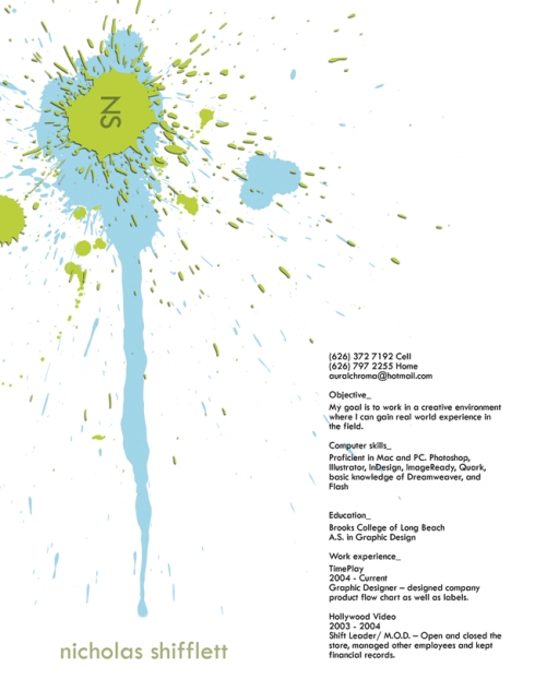
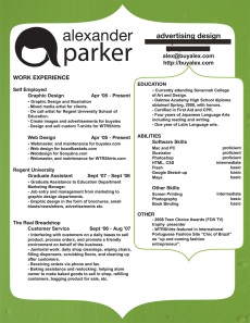
I am updating my resume once again, just the information for now, but I’m thinking it might be time to spruce up the design. Despite reading an article entitled “The Resume is Dead, The Bio is King”, I still think that the resume can be a very valuable tool for giving a potential employee a snapshot of your experience as well as an example of your design work. So I’ve been looking at some examples of graphically designed resumes. Here are a few of my favorites:

I like how the text is simple and there is still a lot of white space but he added that splash of color and art to make it unique.I like how he kept it simple with the text and kept plenty of white space while adding a splash of color/art to make it unique and give it that extra touch to stick out in the employers mind.

via: buyalex

I like how the green background has just a touch of texture, and I am impressed with how much information they got on this one page. Check out some more at buyalex on flickr.

I love the logo in the lower right corner and how it’s used within the page itself.

Very unique and colorful. It’s definitely a resume that will catch your eye and stick with you.