Monthly Archives: March 2011

Website Inspiration: Design Zoom

I drooled a little when I found this website.  It’s bright and fun with lots going on but it’s not overwhelming. The color scheme is unique, the use of typography is amazing, and it the layout is really interesting.  Overall just an awesome (one page) site.

I love how the creator carried the menu bar throughout the site connecting it to letters of the separate headings


For the Love of Color

Color is so important to design.  It’s essential not to overlook the power color can have in evoking reactions in those viewing the design. Tech King created this great infographic about “The Psychology of Color:”

There are some great websites for playing with color too.

My absolute favorite to find color scheme inspiration is Kulur.
There are also a great deal of awesome widgets and websites for messing around with colors that are like this Color Scheme Designer.


Visual Resumes

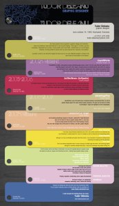
I’ve been seeing a few visual resumes on the internet here and there.  Some are a little crazy, but some are just interesting ways to represent oneself on paper. Not sure how I feel about the whole thing yet, I think maybe just one design element like a bar of color or corner image might be good enough.  Regardless, here are a few I’ve found:


Comfortable Design

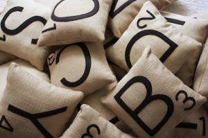
I’ve stumbled across an awesome product on the internet time and again.  I thought I’d share some epic finds.  The focus of this first post about design finds: PILLOWS.
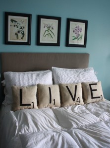
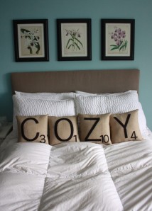
These scrabble-like pillows from shop dirtsa on etsy are amazing.  You can get word sets or just letters. I want:


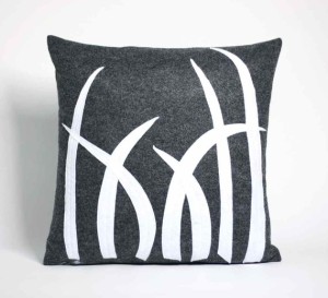
I am also deeply enamored with Alexandra Ferguson’s various pillow designs:

And my favorite:


Awesome Logos (hidden message)

When looking for logo inspiration I came across two posts on the Graphic Design Blog about logos with hidden messages.  They have some really unique examples and some that we see all the time, but I would never have noticed the intricacy until it was pointed out to me.  For example:

FedEx:
Notice the arrow formed between the E and the X. This is for “conveying speed, direction and reliability of this amazing courier service.”

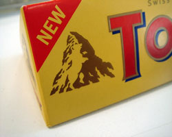
Toblerone:
A picture of the Swiss Alps yes, but more interesting is within the mountain.  Look closely and you will see a bear because “Toblerone originated in Bern, Switzerland – A city whose name is rumored to mean, ‘City of bears.‘”
 

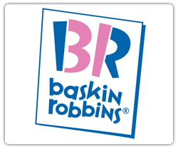
Baskin Robins:
The B and R form a 31 in the middle for their 31 flavors 🙂
 

And a few other favorites:

To see all of them check out the links:

http://www.graphicdesignblog.org/hidden-logos-in-graphic-designing/

http://www.graphicdesignblog.org/more-hidden-logos-sequel/


I <3 Typography

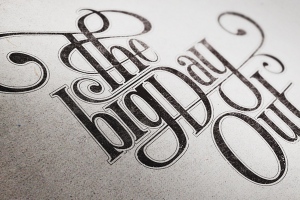
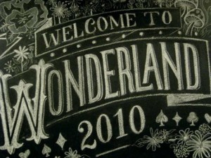
I found a new website today, We Love Typography.  I’m sure it will take up a great deal of my time scouring this site for awesome images.  Here are a few I already have found and love:


Website Favorites

I came across Mark Hobbs’ website.  He is a graphic designer and, well, he’s not normal.  At least according to himself.  He has done a unique thing when promoting himself: he is cocky.  Instead of saying he designs for print and the web he says “I create print & web awesomeness. And no…I am not normal. I am much more than that. I’m extraordinary.”  Well I do love his website I’ll give him that much.

I love these info-graphics he puts in, and I also love that his menu bar follows throughout the site.


Design Quote Posters

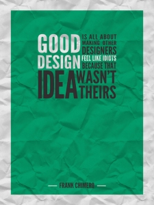
Some day I will have an office all my own (not a dorm room that is my office, bedroom, kitchen and half-bathroom).  When I do I am sure I will get a bunch of different awesome posters like these that I shall frame and make my walls look both awesome and inspiring:

These are a couple of Andrei Bocan‘s great posters:

Amazing wall decal. The best rule for designers is Number 1: “Designers are meant to be loved not to be understood”:

Cool letterpress calendar:

And the last I’ve come across so far, “The Thing I Love About Graphic Design” poster:


Amazing Infographics

I’m learning to love infographics.  So much of life is boring stats and and lists and so on that these amazing graphs and tables and more make mundane things much more interesting.

This one is great, a periodic table of typefaces:


Here is an infographic that was in Deliver Magazine (March 2009).  It depicts the kind of mail people get sent to them:


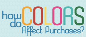
And last one for today, How Color Affects our Purchases.  There are some really cool graphics within this and all together it makes a really awesome display of information (these are just some clips from the entire file, follow the above link to see the entire graphic):


Web Design Favorites

Every once and a while I come across a website that I just LOVE. I stumbled across one such website recently and I just had to share:

Without further ado, Breathe Architecture: